 |
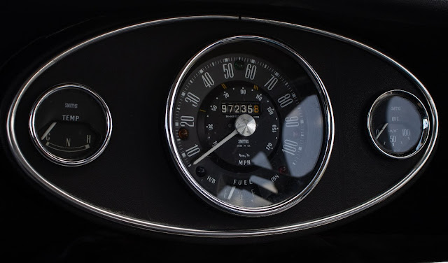
| Austin Mini dashboard circa 1966 |
When I looked up the origin of the word ‘dashboard’ most references were to the wooden or leather boards carriage makers attached to the front of carriages to prevent mud and rocks from being splashed onto drivers and their passengers by the horses that pulled them about.
When a horse kicks up debris it is also referred to being ‘dashed up’ (although I can only find one reference to this). So the board on the front is to protect from the horses dashing, hence dashboard. Incidentally, in the same article, the author states that the word car is a shortened version of carriage.
Naturally, this form of protection from dirt and mud was used by the Mesopotamians on their chariots back around 3,000 BCE.
So, as I said, in modern cars the dashboards can be baffling. The trouble is that when faced with information overload the tendency is often to zone out and ignore. But how do you know what all these warning lights mean and which ones are critical and which are not? And on top of that the signs must be obvious and understandable around not only this country but anywhere in the world so who designs them and how are they ratified?
Which was the wrong question as after wading through dozens of web sites it became obvious that there is no universal standard. They seem to be based on a picture is worth a thousand words and that’s even if you are one of the few who read the manual. I came across one site that boasted 683 inspirational designs for dashboards.
So how are the individual dashboards designed. According to Actia, one of the companies that does this sort of thing, the effective and ergonomic design of a dashboard starts with a blank piece of paper. Hurrah.
Before starting any manufacturing process, they must develop a design to guide the creation. The design and development stage is crucial for any prototyping. Often, machinists draft a series of CAD models, then go with one that captures how they imagine the end product. Designers of these interfaces have had to learn ‘kinetic typography’ to create interfaces that draw the viewers eye to the most important part of the information at the right time. Oh joy - kinetic typography. No idea.
About the same amount of joy as finding ‘keuomorphic design’ – design that looks similar to the original mechanical items it’s replacing – which was the obvious first step in replicating the interfaces because people need to feel comfortable using these new systems without having too much cognitive load.
Which reminds me of a chat I had with an AA bloke once and he was telling me of his previous call where the customer had reported that his coffee cup holder wouldn’t open.
I started off this blog describing the dashboard of my old mini so I’ll leave with an image of a futuristic display. I presume that all this technology has been proved, or will be proved, to be far safer than back in the day. But from my point of view (literally) it scares the living daylights out of me. I doubt I’d even want to be a passenger in one of the things.
This poem by Dave Kavanagh is very good.
Feet on the dashboard
sleep to the sixty five
jazz cafe sounds
of a voice piped through
a blaupunkt radio
scented smoke
and a sweet briar voice
like fresh cherries
and bitter black chocolate
the drumming sound of rain
hypnotic wipers
and eighteen wheels
eager to be home
seven hundred swedish horses
chewing up Welsh mountains.
mac on the wheel,
wheezing on the citizen band
joking with the snow man
singing songs 'bout the homeland.
and randy sings
a rainy night in georgia
easing me to sleep.
feet on the dash board
head nodding in her storm clouds
Dave Kavanagh
See more of his work, and you’ll enjoy it, on his website ‘Clinging to the Sides’.
See more of his work, and you’ll enjoy it, on his website ‘Clinging to the Sides’.
Thanks for reading, Terry Q.


3 comments:
Very interesting facts Terry but to be fair, It’s not the modern dashboard that seems to have you bamboozled, Its the seatbelt!😂
The Mini dashboard was simple but stylish. After all, what more do toy need to know other than how fast you're going and how much fuel you've got.
I enjoyed Dave Kavanagh's Trucker poem, some great lines. I've never driven an HGV.
A fun and informative read - carriage to car - origins of dashboard all make sense - who would have thought. I'm with you on the new space age dashboards, jump every time one of those warning sounds and icons pop up! I miss the first car I drove, my mother's red 1974 mustang - classic :)
Post a Comment